Opened at 2011-08-10T07:02:38Z
Closed at 2020-01-16T20:48:43Z
#1475 closed defect (wontfix)
Website Design and Logo Proposals
| Reported by: | sirvaliance | Owned by: | sirvaliance |
|---|---|---|---|
| Priority: | major | Milestone: | undecided |
| Component: | website | Version: | 1.8.2 |
| Keywords: | logo website design style aesthetics | Cc: | |
| Launchpad Bug: |
Description (last modified by exarkun)
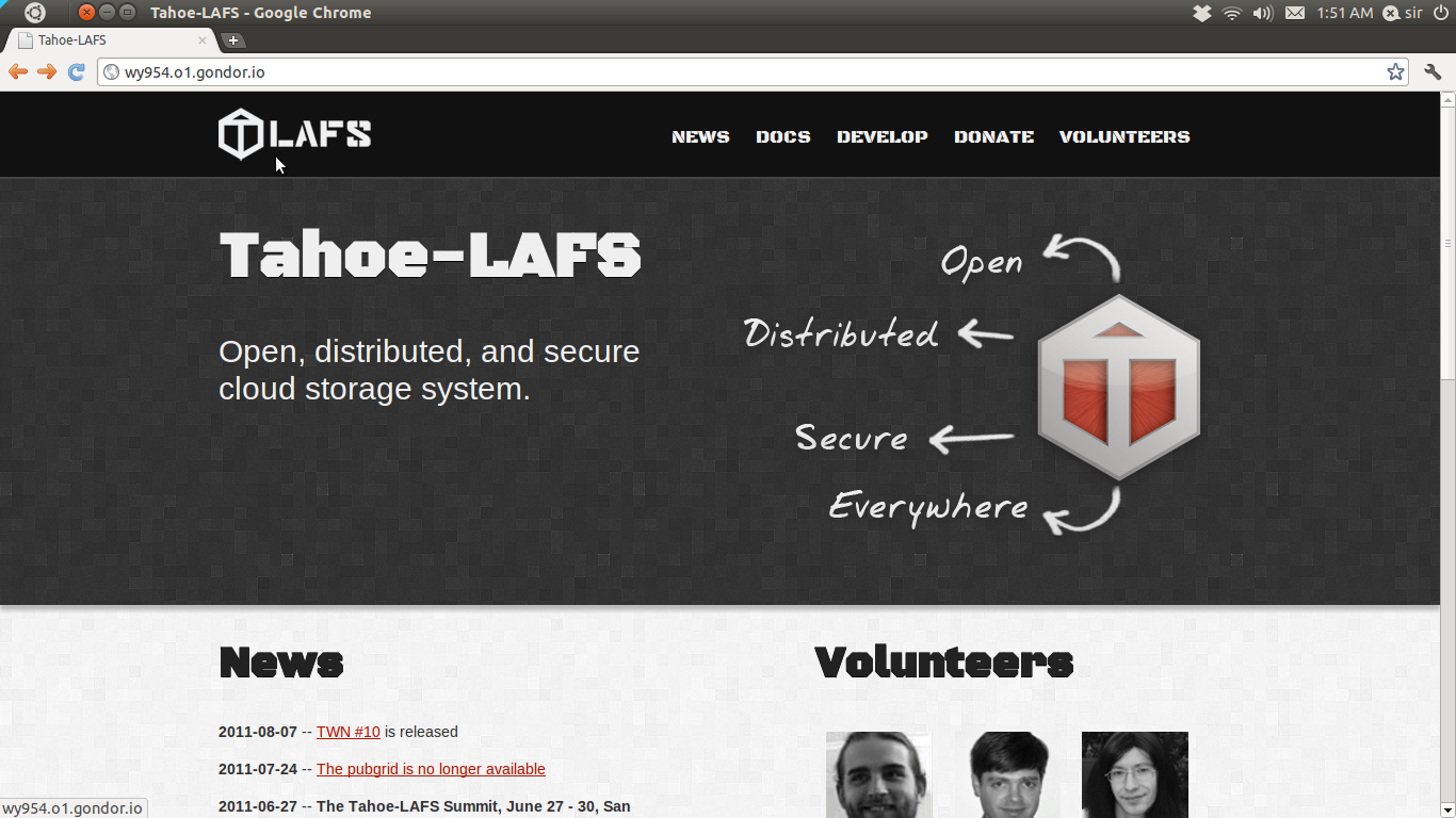
I (sirvaliance) started working on ideas for a new Tahoe website and logo and have attached the preliminary logo proposal and screenshot of the website. The test site can be found at http://wy954.o1.gondor.io/, but may change at anytime. The website is a rough start and has only been tested using Chrome.
Initial reception (from IRC) for the logo was that the stencil font was too militaristic. As for the website, most felt that they would prefer minimalism and simplicity over the current setup.
The topic of logo design is still open in Ticket #1185.
I would prefer a discussion of ideas on what they would like to see from the redesign before I move forward. I would also appreciate the posting of links to other websites that are in the vein of what you are all looking for. This would include a color palette as well. The designs I made took into account that zooko preferred the black/red color scheme so the palette was greyscale/red.
Attachments (2)
Change History (7)
Changed at 2011-08-10T07:03:55Z by sirvaliance
comment:1 Changed at 2011-08-10T07:08:11Z by sirvaliance
- Description modified (diff)
comment:2 Changed at 2011-08-12T17:43:40Z by zooko
Want: simple, human, professional, informative, good use of whitespace, quotes from satisfied users, pictures of faces (volunteers, and maybe faces of satisfied users, too?), humor (non-offensive), statements that are factual and precise, navigation that is well-organized so that people can find their way to more information or to other destinations: mailing list, source code, bug tracker, etc.
Don't want: militaristic, counter-cultural, politicized, offensive, over-selling, over-polished inhuman corporate bullshit, over-polished salesperson bullshit, web 2.0 shiny cartoony appearance, taking potshots at competitors, offensive language like the word "bullshit". Dark-background-light-text.
Web sites that I like: hm, um, I can't find any. :-) I like the appearance of http://apple.com but not the content. I like the content of http://lwn.net . I don't know if I like the appearance of http://lwn.net it is fine.
comment:3 Changed at 2011-08-29T16:52:02Z by zooko
- Owner changed from somebody to sirvaliance
sirvaliance: please let me know if there is anything else you need from me in order to do the next iteration of this.
comment:4 Changed at 2012-03-29T19:47:27Z by davidsarah
- Keywords aesthetics added
comment:5 Changed at 2020-01-16T20:48:43Z by exarkun
- Description modified (diff)
- Resolution set to wontfix
- Status changed from new to closed
The linked site is gone and I assume that at this point if we wanted to revisit the Tahoe-LAFS logo/branding/etc we would be starting from scratch and not from this work.
This image is the logo proposal.